
This is my favorite Burger King’s poster among the classwork. The rhyming slogan can be easily remembered as well as the stark differences between the Premium Kuro Burger and the original burger can make the special one more impressive.
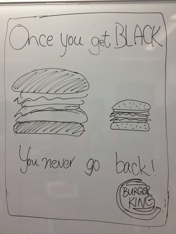
The promoting message of this poster is the Burger King’s newly launched product - Premium Kuro Burger. The buns of this burger are black because the dough is colored with bamboo charcoal.
The overall design of this poster is very clear and minimal since there are basically 3 visual elements in the poster. First, Two burgers, a large Premium Kuro burger and a small original burger, are placed in the center of the poster. Second, the rhyming slogan “Once you get BLACK, you never go back!” is separated in two phrases placed on the top and the bottom of the burgers. Third, the logo of the Burger King is put at the bottom right hand corner of the poster.
I love this poster out of 2 reasons. In the first place, the rhyming slogan is very simple and easy to remember. The catchy slogan suggests that we will never choose the original burger after we get a taste of the Kuro Burger. This definitely suits the purpose of this poster as well as matches the major visual element (the Premium Kuro Burger) in the poster.
In the second place, the comparison between the Premium Kuro Burger and the original one is crystal clear. People will focus on the Kuro burger instead of the original one because people tend to pay their attention to a larger object. Also, the special black color buns stand out from the poster when it is put together with a burger that is commonly sold in other fast food chains.
All in all, the design of this poster is minimal which the audience attention will not be sidetracked by other visual elements. In addition, the arrangement of text and visual elements is good, allowing people to understand and remember the advertising message easily.
Source: http://ge2409.weebly.com/uploads/1/3/2/5/13255416/7777197_orig.jpg

